Apty Design System
Scalable analytics design system built for flexibility and customization
The Problem
Analytics platforms often become difficult to scale as new data types, visualizations, and user requirements are introduced.
- Different companies require different KPIs and workflows
- Dashboards become inconsistent over time
- Customization introduces UX complexity
The Solution
A flexible and modular design system for Apty Analytics, built to support customizable dashboards, scalable visualizations, and consistent experiences across products and devices.
Designed for adaptable analytics experiences
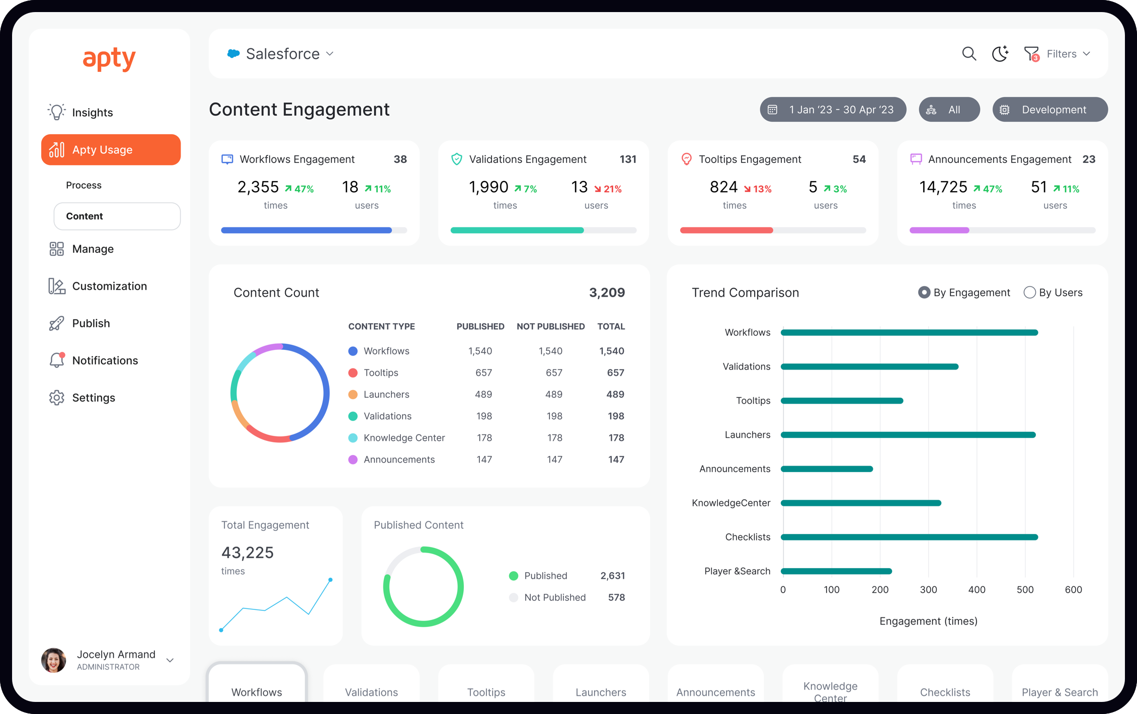
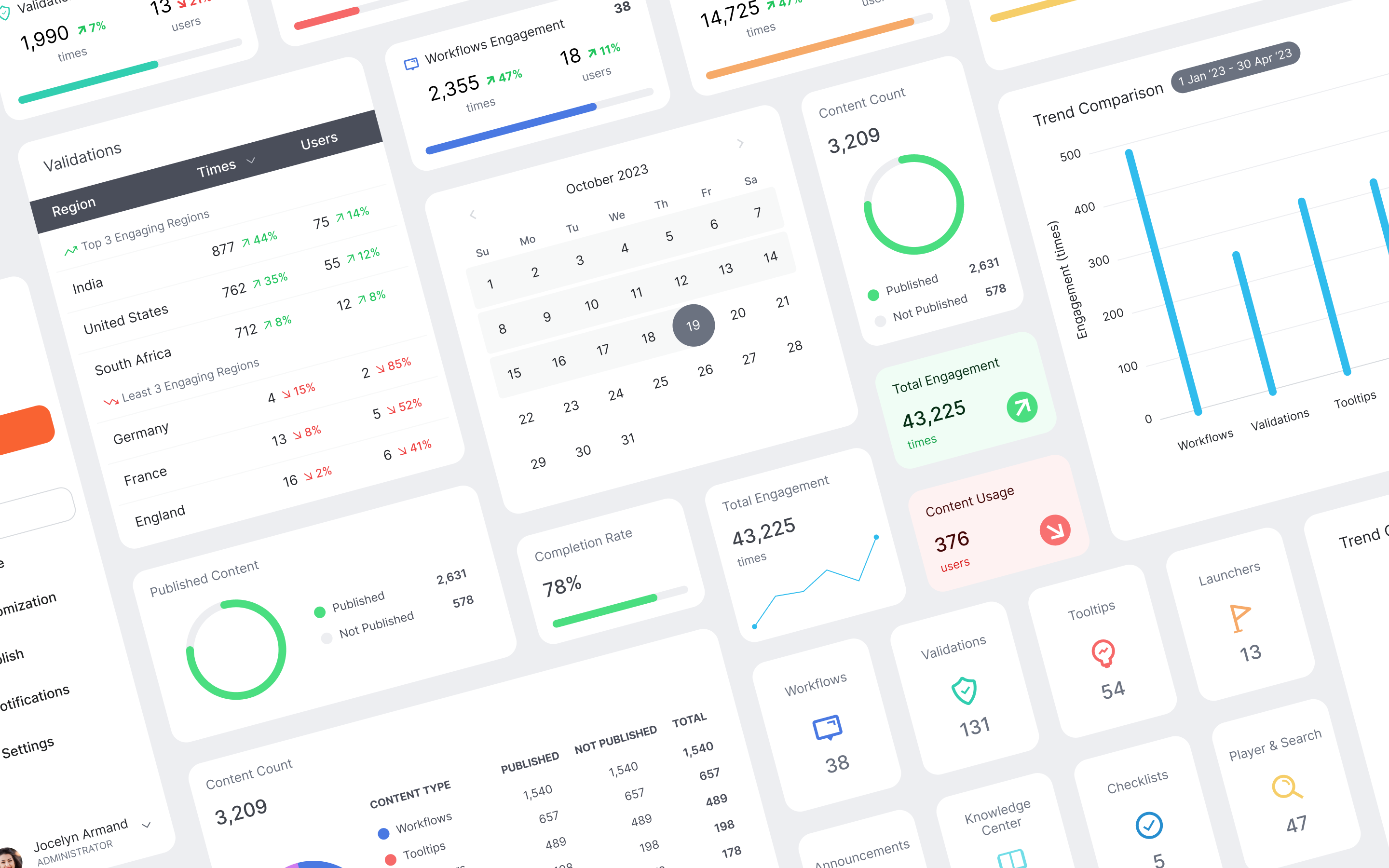
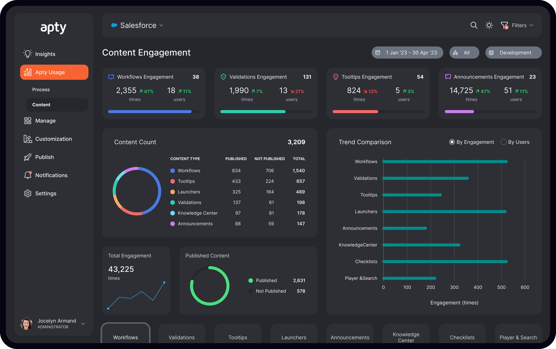
Modular Dashboard Architecture
Every widget was designed as a flexible module capable of adapting to different data types, sizes, and user needs.
- Configurable metrics and layouts
- Responsive widget behavior
- Designed to support multiple dashboard compositions
Scalable Navigation System
The navigation experience was redesigned to improve usability while supporting role-based customization and growing product complexity.
- Customizable navigation structure
- Improved discoverability and hierarchy
- Built to support different user roles and workflows
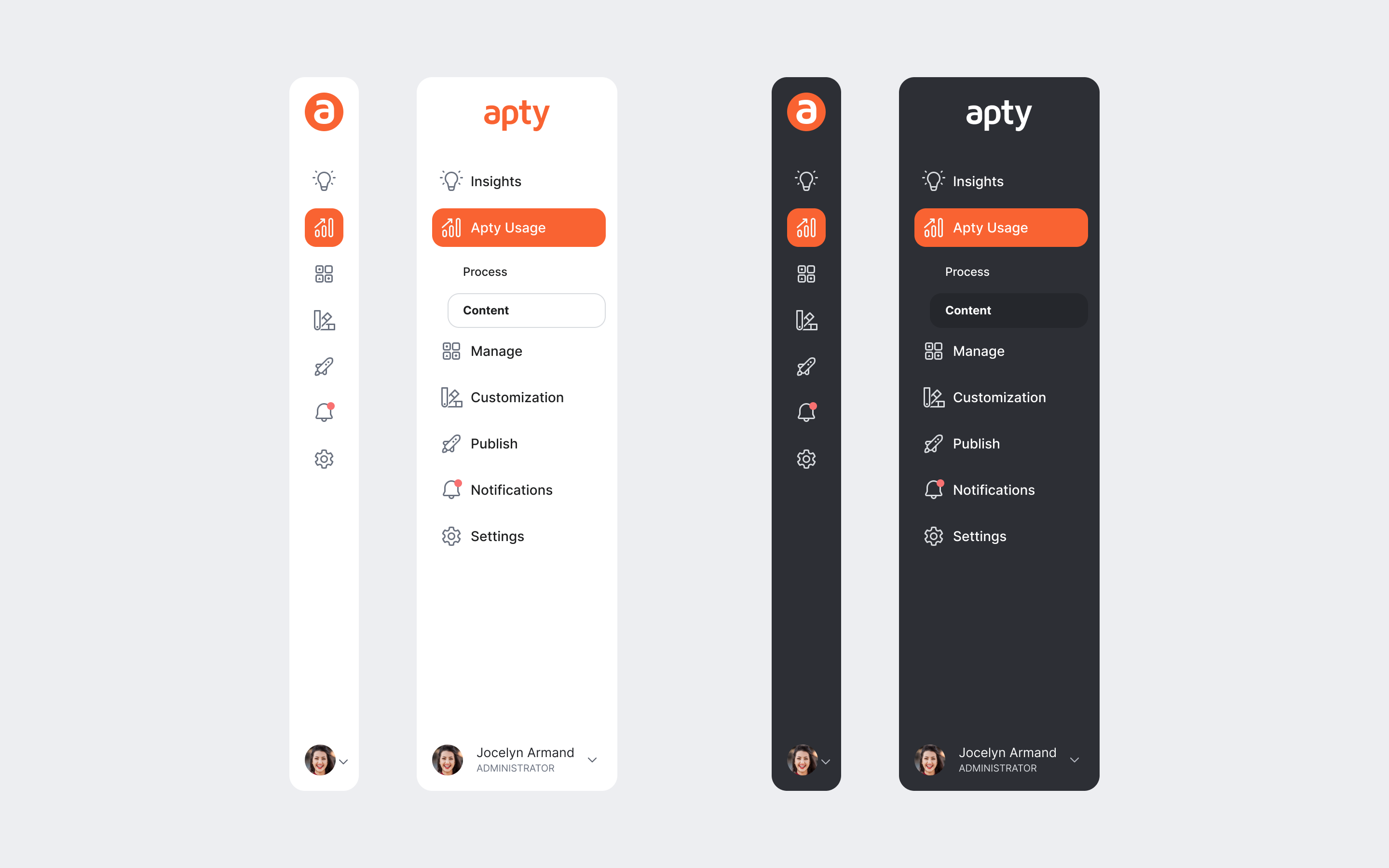
Light & Dark Theme System
The design system was built with full theme support to ensure visual consistency and accessibility across environments.
- Unified visual language across themes
- Optimized contrast and readability
- Consistent component behavior between modes
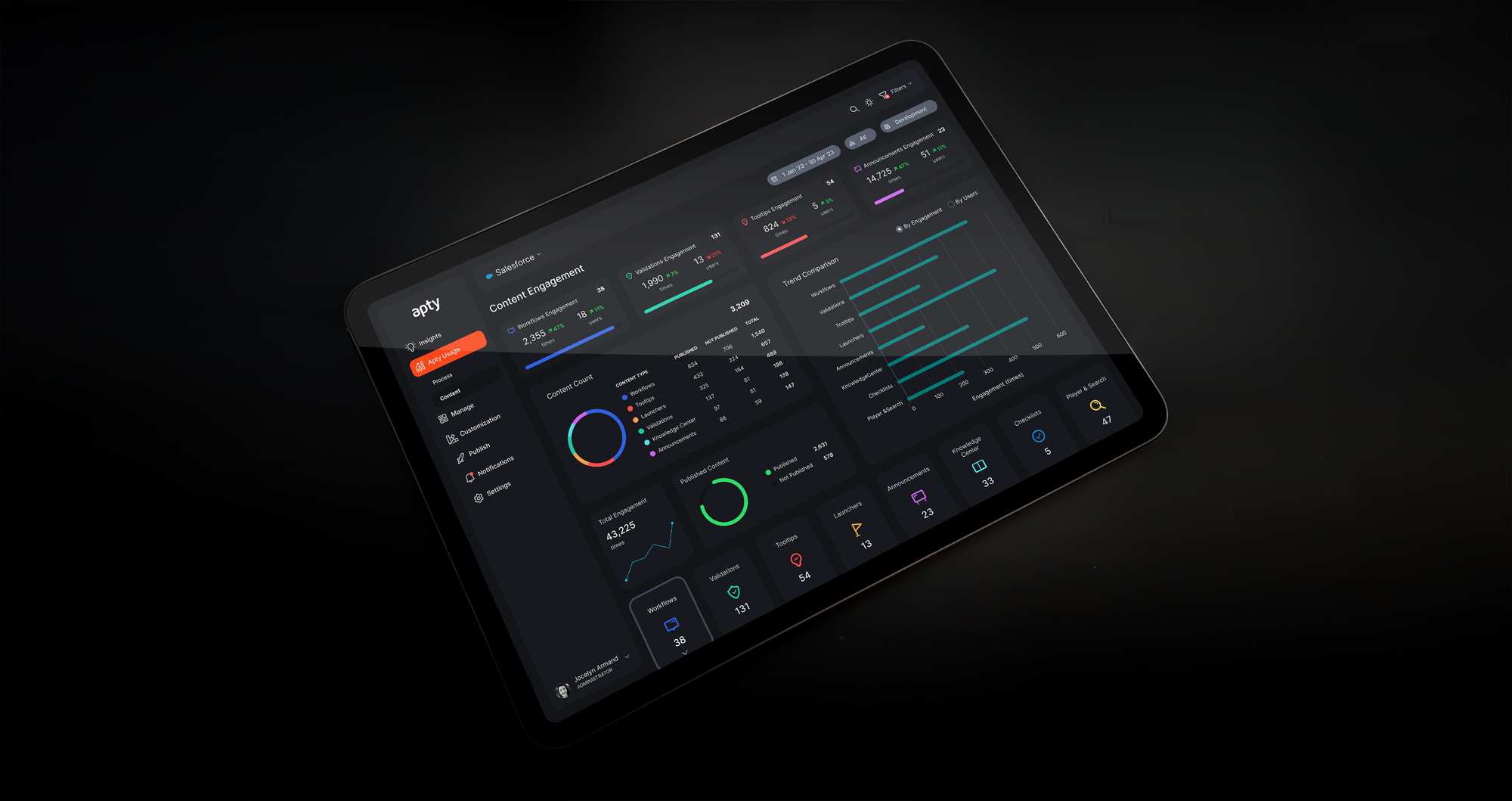
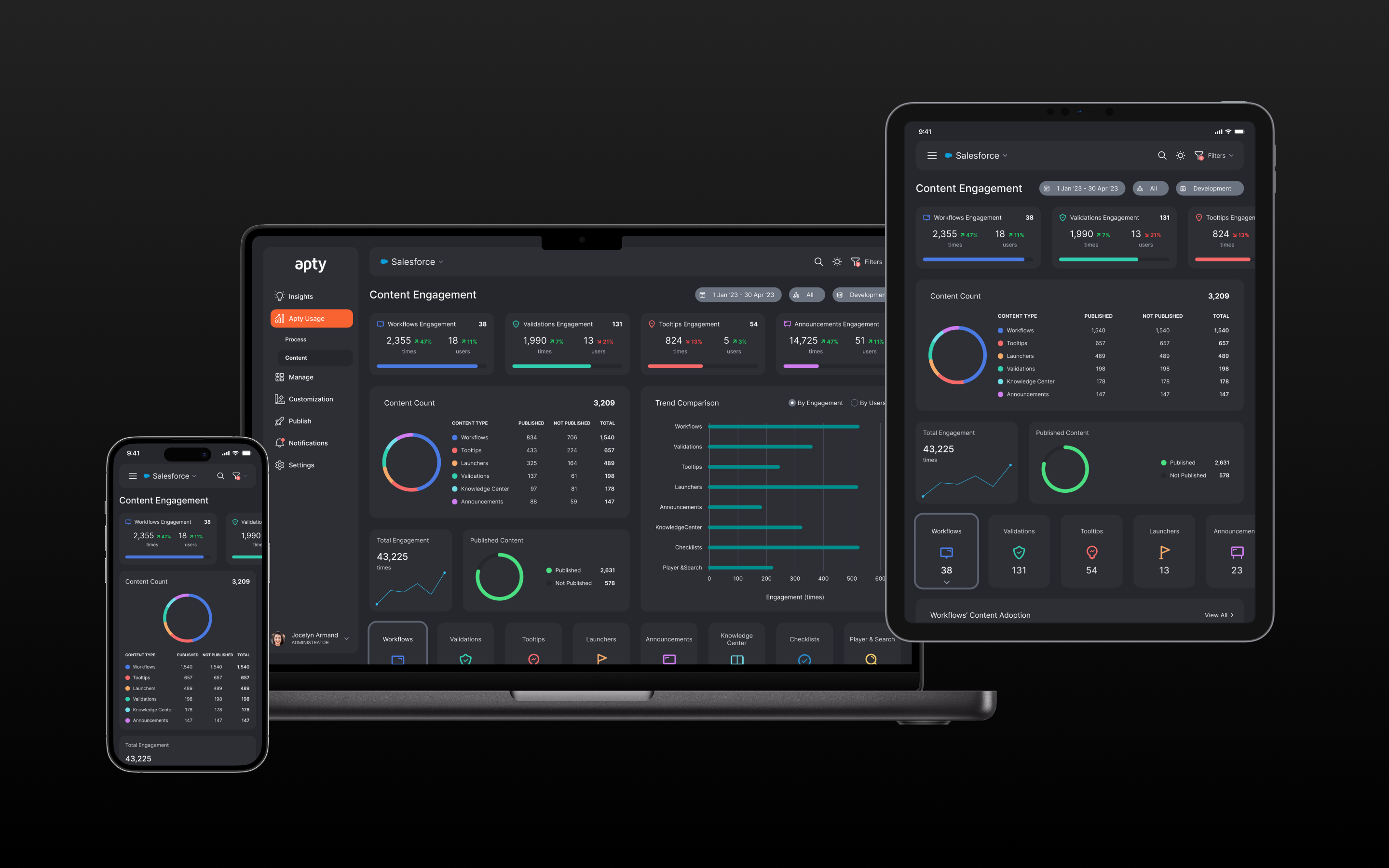
Responsive & Cross-Platform
The system was designed to scale seamlessly across screen sizes and devices, enabling a consistent analytics experience everywhere.
- Adaptive layouts for multiple resolutions
- Shared design language across platforms
- Built for long-term scalability
Outcome
The resulting design system established a scalable foundation for Apty Analytics, enabling faster iteration, greater customization, and a more consistent enterprise user experience.